The Story Behind Qwoted’s Rebrand

Keen-eyed users will notice a few changes to our look and feel. After two years, we’re implementing a rebrand! We hope you like it.
Changing our design was more than just an aesthetic decision. We are on a mission to bring clarity on transparency to the PR and media community. We hope that our new, cleaner visual imagery reflects that.
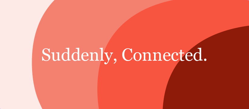
Our new tagline: “Suddenly, Connected” underscores our goal to foster meaningful relationships between media and PRs at speed. The number one compliment we receive from users is just how quickly they are able solve a problem or identify an opportunity with Qwoted. Our new logo, ‘The Speech Bubble’, reflects our belief that what the PR and Media communities need is a better platform for dialogue and communication. (Extra observant users will notice that the bubble was always present in our original logo, ‘The Quill’.)
In redesigning our brand, we have made sure to place accessibility at its heart to recognize and support the diversity of all users. Our rebrand follows ADA Accessibility standards and underscores our belief that Qwoted (and PR) should be for everyone. We wanted to make a statement with our updated colors and helpful navigation. The coral you see in our logo references our fresh approach to revolutionizing the world of PR. Our periwinkle accents symbolize our dedication to reliability and trust. And matcha green is used to represent our fostering of success, productivity, and growth.
And all of this is just the taste of things to come. We have plans to further improve our feed and overall user experience over the coming months!
As always, we love hearing from our media, PR, and individual / small business, users! If you have any questions or feedback on this rebrand, feel free to reach out to us at marketing@qwoted.com.
Dan Simon
CEO, Qwoted
POPULAR POSTS
